My name is Lisa Staton. I make the Memory Boxes , working alone in my studio in Exeter, Ontario. I search Ontario for artifacts and treasures that artfully tell the story of our past.
Custom Creations
I will also work with you to assemble your treasured objects to tell your story and give substance to your precious memories.
Scroll down for examples of my work; currently available or recently sold.
Shop Now
These nostalgia pieces are currently available. (Scroll down. Click on each piece for price & details.)

The two Goderich businesses in the title were a central part of the area’s industry. https://huronremembers.ca/index.php/node/226 . I have included an ice cream wrapper and a bottle top in this design. The Saltford Heights Creamery was owned by the Bisset family. Other Bisset memorabilia is held at the Huron County Museum and Historic Gaol in Goderich. https://huroncountymuseum.pastperfectonline.com/webobject/4225E353-154D-456C-B66A-743797812934, 12”x 15”
I named this memory box after a silvery metal piece with the Raymond Manufacturing Company name on it: it would have been attached to a sewing machine. https://www.raymondsewingmachineresearchproject.ca/ The company was prominent in Guelph from 1852 until it was sold to the much larger White Sewing Machine Company of Ohio in 1916. I liked the local reference and the shininess and shape of the object. I correlated the tall narrow frame design with the postcard on its long axis and the placement of the buttonhook, 7”x 15”
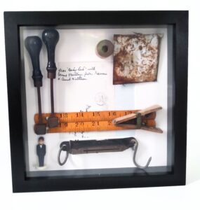
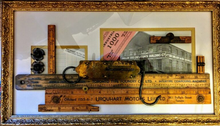
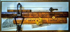
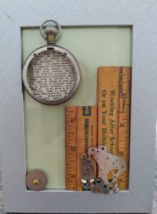
Dark black handles on the stamps and the black frame offer a stark contrast to the bright white background. I chose unusually shaped objects, such as the weigh scale and the large wooden clip, as well as the whimsical bridegroom cake topper. www.todaysbride.com/blog/cakes-desserts/2017/07/14/choosing-your-wedding-cake-topper/ The warm yellowy brown of the rulers introduces a third design and colour element, 10”x 10”
The use of dictionary pages that relate to the objects in this piece is a way to bring a typographic element into the design. The type on the pages relates to the type on the rulers. I used a strong horizontal shaped frame here to tie in with the rulers’ shapes and length. Horizontal lines here denote the stability and evenness of measuring and manufacturing. www.hatchdesign.ca/elements-of-design-part-1-line/#:~:text=Horizontal%20Line,to%20a%20particular%20focal%20point I employed smaller round objects as a contrast to the rectangular shapes.
.
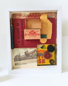
Deep bright red that you see in the book cover was a common colour for printing and books in the late 19th century and early 20th century. It is likely it was an easily available and inexpensive dye colour, as well as one that had a rich look. The small box that used to hold thumb tacks reflects that same red, and it stands out against its cream background. www.edgee.net/how-to-apply-the-7-elements-of-design-to-your-work-element-7-colour/ The tin section and the red checkers piece draw that colour in from the rest of the design, 9”x 11”.
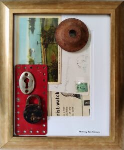
Turquoise and red contrast in this memory box for a bright sharp effect. A gold frame warms up the design and glows warmly against the metal pieces. I like the way the green stamp on the back of one postcard is reflected in the turquoises and blue greens on the front of the Muskoka Lakes postcard. www.artclasscurator.com/principles-of-design-examples/#:~:text=As%20a%20principle%20of%20art,and%20drama%20in%20an%20artwork I contrasted the rectangular shapes with the circular shapes and holes in the metal pieces, 10 ¼”x 12 ¼”.
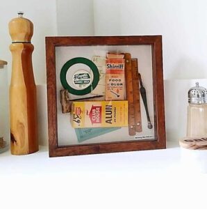
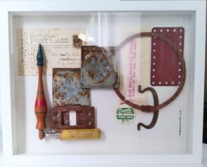
This memory box came together around the bottle cap from the local Southern Ontario town, St. Mary’s. www.vitacollections.ca/museums/2817603/data?grd=1510&rows=20&sort=madePublic%2520desc&p=2 I used the larger round shape of a green game piece to mirror the bottle cap’s shape and colour. I brought in the colourful food colour box and the Alum box. I matched the warm brown of the two folding rulers and the handle of the hand drill with the brown frame. In the background are a game card and a game piece, 9”x 9”.
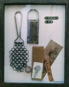
Antique kitchen and carpentry tools are interesting in their use of materials, their functions and their shapes, sizes, colours and designs. The “Lacy Tool” www.blog.housewares.org/2011/10/25/housewares-history-dishpan/ is a pot scrubber that was strong enough to use on cast iron cooking pans with salt or sand as an abrasive cleanser. It really is quite beautiful for something as utilitarian as cleaning a pot! I matched it with the small grater because the grater holes seemed reminiscent of the larger holes of the scrubber, and the metal colour is similar, 11 ¾”x 15”.
SOLD. Warm golds and browns make a tonal statement in this Found Object piece. Brass, mellowed wood and gold paper, as well as a gold frame all work together. I was fortunate to find a used frame that had attractive carving in gold along with gold edges around the mat openings, both of which would match the metal and wood of the design pieces. It was also useful that the frame was long enough horizontally to accommodate the 12” rulers. These first design experiments were done with some objects placed behind the mat and the glass, some behind the glass on top of the mat, and some glued directly to the top of the glass. This layering adds another dimension of depth to the design.
SOLD. Although the covers of two different books are utilized, the red in each create a natural pairing of colour, form and texture. Both covers have a decorative edging stamped or printed on, which reminds us that the manufacturers added beauty to even the most utilitarian objects or parts of objects. It was unusual for me to place the pen, ruler, and small book cover pieces on the diagonal here. They end up being highlighted since they diverge from the strong horizontals and verticals of the other items. www.yourartpath.com/types-of-line-in-art-meaning.
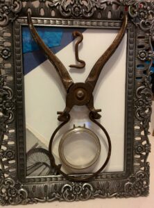
Sold, The heavy-duty handle on the round jar opener seemed perfect in opposition to the delicate filigree of the frame and the delicate round watch cover. You can see the same type of contrast in the black and white photo in the bottom left corner of an old-fashioned bicycle wheel. The spokes look delicate compared with the actual outside of the wheel. I put the small, curved metal hook at the top, between the handles, as a reference to both the metal and the curves in the other pieces.
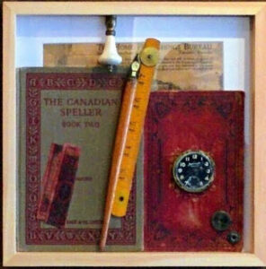
The Mitchell High School is memorialized in the small blue label in this memory box. The label was in a textbook and the book was probably a prize given out for school attendance or for a certain grade achieved in a school subject. www.cambridge.org/core/journals/studies-in-church-history/article/abs/sundayschool-book-prizes-for-children-rewards-and-socialization/DDB9D7AD5D056A9A2ECE8F07218997D3 I put the label together with the small boxes because the scale was similar and the deep blue colour was in the same tonal range, 11 ¾”x 15”.
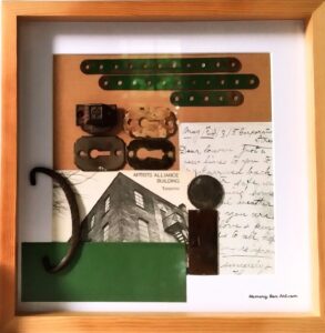
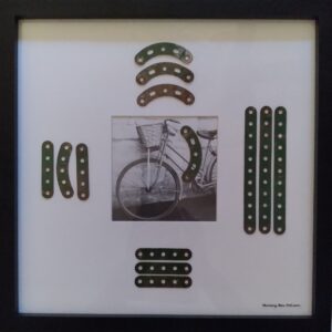
I conceived of combining objects that are green and metal pieces of various shapes and sizes for “Toronto Artist’s Alliance.” The title derives from a black and white postcard which has an unusual photographic angle of the building which housed the Alliance. I used the reverse of another postcard to highlight the penmanship of the era. The green items naturally form a tonal overlay, with the greens all in the same range, 10”x10”.
The postcard has bright red typography at the top of a turquoise photograph of the St. Lawrence River and the islands. www.visit1000islands.com/ Postcards from this popular tourist area would be sent to families and friends to share a vacation memory. I added other red elements, such as the Meccano piece and the key tag, 12”x 15”.
I liked the sepia tone of the postcard photograph of the old bridge in St. Jacob’s Ontario. www.historicbridges.org/b_a_list.php?ct=&c=&ptype=county&pname=Waterloo+Region,+Ontario There are not very many of these bridges left, so it is great to see this one preserved in a postcard. The metal span of the bridge ties in with the metal Meccano pieces and the metal tool and keyhole cover, 10”x 10”.
I highlighted the green Meccano pieces in this design by placing them on a white background. Green became very popular in the 19th century and this shade of green was used in many industrial applications. www.artandobject.com/news/green-19th-century-cultural-history The Meccano educational pieces were meant to imitate and create industrial machinery, 14″x14″.
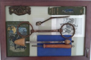
I used different kinds of rectangular flat pieces as the background in this Found Object design. The overlaid objects have round shapes for contrast. They are also more neutral in colour than the book covers. The metal parts have harder edges than the soft worn surfaces of the books. I like the name of the title of the book, “Wonder Child.”, 12″x 17″.
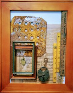
The Found Objects’ textures in this design are quite rough and worn looking. They have wear and tear for different reasons; some from being handled, like the rulers, some from disintegration of the materials, like the large, manufactured piece with the multiple holes. I don’t know what the large piece was used for, but it has an attractive symmetry because the holes are evenly spaced, 14 ½”x 17″.
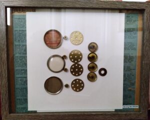
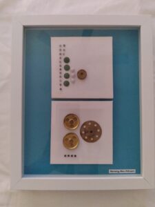
I took several pocket watches apart to use the pieces separately as design elements. Grouping the round pieces by size creates a pattern in the centre. I placed the larger rounds on the right and then moved in descending size to the left, to produce a sense of movement across the work. Two vertical strips in a dark blue down each side nevertheless act to confine the movement to the centre, 11 ¾”x 15″.
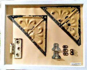
I worked with some larger Found Objects in this piece, with a much lighter frame, in this case, white. The white frame makes the objects stand out more brightly. I used a peach pastel background to bring out the beige tones in the ceiling tiles and the plain background also allows for emphasis on the tiles’ embossed fleur de lis design. www.metalceilingexpress.com/blog/victorian-metal-ceiling-tiles/ The fleur de lis was part of the Gothic revival of the Victorian era and was popular on woodwork, furnishings, and metal household items, such as door rosettes, 11 ¾”x 15”.
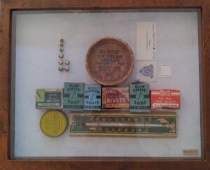
I found the boxes of shoe tacks at Dale’s Antiques www.dalesantiquesandmennonitefurniture.com/ when I was initially attracted to the shape and colour of the boxes. When I took the tacks out of the boxes, I liked the idea of using the shiny tacks for a repetitive pattern. I wanted a bright turquoise and white background so that the warm brass colour would show up, and square shapes to contrast with the round objects, 8 ¾”x 10 ¾”.
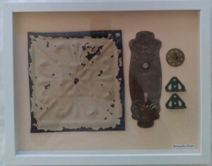
A large, distressed tin tile is the focus here, with the original paint still on the tile. The embossed pattern is reflected in the decorative elements in the doorknob and keyhole plate beside it. Victorian decoration was popular since opulent decorating meant you were financially successful. Combined with the Industrial Revolution and the ability to manufacture anything, there were many different styles developed. swww.masterclass.com/articles/victorian-interior-design-guide, 11 ¾”x 15”.
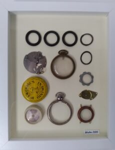
One object in this design stands out because of its bright yellow colour. I wanted a clear focal point, differentiated from each of the other objects that are a round shape. www.virtualartacademy.com/focal-point-in-art/#:~:text=What%20is%20a%20focal%20point,wanted%20to%20capture%20the%20scene. I also used a pale-yellow background to tie the colours together. The soft background colour highlights the dark, warm tones of the metal pieces.
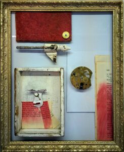
I combined cream, red and gold for a rich tone. www.artsy.net/article/artsy-editorial-history-gold-art-ancient-egyptian-burial-masks-jeff-koons Gold can bring a sense of luxury and extravagance to visual images. The shiny objects, like the watch parts, add to the sense of richness as does the matte texture of the red pastel on the book pages. A small box within a frame, square edges of paper, and the segment of a book cover all combine to reinforce the shape of the rectangular frame. Even the hinge pin and the curtain rod hook have linear elements, 8”x 10”.
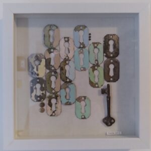
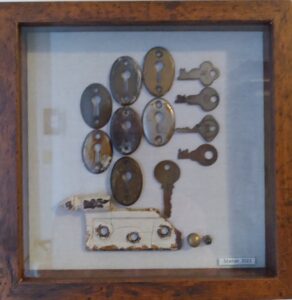
These keyhole covers still have paint on them left over from when they were attached to doors. www.craftylittlegnome.com/yes-you-can-spray-paint-door-knobs/ It is likely that the covers were painted over because of a lack of interest in seeing older-looking hardware. There is a period between when an object may be considered an attractive antique and when it just looks tired and needs a fresh coat of paint. Wooden doors also got a lot of wear and tear, and when the door was painted to refresh it, so was the hardware. I grouped the keyhole covers by colour, to add to the symmetry of the design, 9”x 9”.
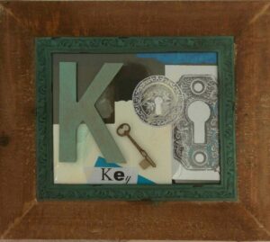
A large alphabet “K” is the focal point of this barnboard-framed piece. I have placed an actual key, as well as the word “key” on the glass, to aid in pulling together elements that invoke the idea of a key. I found two ornate keyhole covers and photocopied them in black and white as a separate graphic element and to add some grey scale to the colourful turquoise in the inner frame. www.coreldraw.com/en/tips/graphic-design-principles/contrast/, 9”x 12”.
This is the first time I put a graphic all-over background behind the objects to situate them in a larger context. In this case, a barn or outdoor setting is evoked as a place where the lock, keys and keyhole covers might be found. I arranged the keyhole covers in a strong vertical pattern as a contrast with the background vertical lines. The brown lines also add warmth to the work as against the bright white frame, 8 ¾”x 10
This is one of two works that were submitted to the Blyth Festival Gallery’s Community Show and were displayed from May to September 2022. The mid-19th century door hardware, while utilitarian, also had beautiful design elements. Key shapes were more decorative than they are now. www.collectorsweekly.com/tools-and-hardware/keys Even though the hinges were made of cast iron, they eventually could break because of rust, as the one in the memory box has., 9”x 9”.
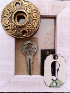
A pale colour for the frame creates a more contemporary look for this design. The scale of the more delicate 3”x 5” works means that the objects also need to be small to balance the whole effect. I put two very decorative pieces with two plainer items. The original purpose of the highly ornate round door rose, or rosette, was to cover the inner workings of the doorknob and latch. www.vintagehardware.com The square piece in the lower left is a keyhole cover, or escutcheon, which prevented the key from damaging the door, 3”x 5”.
This unusual frame was the instigation for the overall design, with its decorative filigree silver pattern placed on top of the light wood. I wanted to match the silver with other objects, especially shiny round objects. www.agelessheirlooms.com/faq-what-does-the-word-filigree-mean/#:~:text=The%20word%20can%20also%20be,unique%20and%20often%20dainty%20design. Filigree was prominent in Art Deco objects in the 1920’s. I wanted to highlight the pocket watch used around the same time, 5”x 7”.
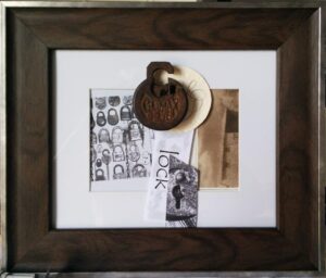
This is a more simplistic design than most of my others. I experimented here with only one Found Object as a focal point. The frame itself is quite beautiful and I let the frame show through by not crowding the center. I matched the dark brown of the frame with the dark brown of the lock. I matched the silver part of the frame to the pale grey of the photocopy of locks. The mixed media here create layers of colour and texture. www.tate.org.uk/art/art-terms/m/mixed-media, 11 ½”x 14”.
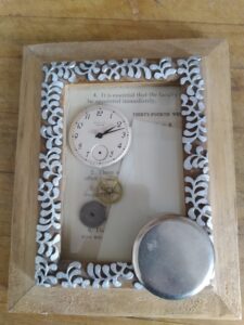
Shiny pocket watch parts are appealing reminders of yesteryear. A pocket watch can have from 130 to as many as 1,728 parts. www.brelson.com/blogs/news/how-mechanical-movement-pocket-watches-work The round gears have many interesting design features, such as the brass colour and the small teeth around the outside. The parts that are silver look more industrial and mechanical than of decorative. I used both round shapes and rectangles in this design, as well as newspaper type as a background., 3”x 5”.
Wooden rulers were excellent advertising and marketing tools when people did so much desktop work with a pen or pencil. Before computers, you could draw a chart or do underlining with rulers. Schoolchildren could learn to draw geometric shapes and learn basic measurements. www.ruler.co.co.uk The Toronto Dominion Bank green stands out on the light brown wooden ruler, a good advertising technique to make the ruler noticeable, 3”x 5”.
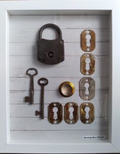
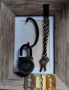
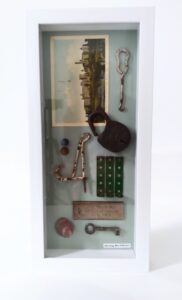
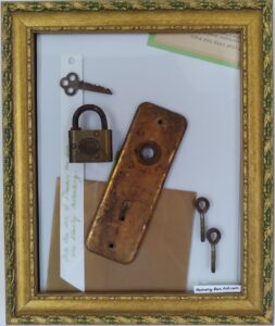
One aspect of my memory boxes is the use of wooden frames to portray an antique look. Wood seems to hearken back to a time before plastics and faux materials. With this wood grain finish, the old lock and keys are a suitable complement to the finishes and objects from the mid 1800’s to the 1900’s. The first portable padlocks may have been manufactured in China. www.broadwaylockandkey.com I like the old-fashioned chain with the two keys, which evokes someone carrying the keys daily on a belt or hanging from a hook, 5” x 7”.
This whimsical piece probably fits a definition of collage more than my other work. www.artincontext.org/collage-art/#:~:text=Collage%20within%20art%20was%20first,cutting%2Dedge%20assemblages%20around%201910
I combined Found Objects with coloured paper, cardboard, old book pages, and my own handwriting. I took the colour theme from the green and gold of the frame. www.framedestination.com/blog/picture-frames/a-brief-history-of-picture-frames I kept to a common idea throughout my work of a juxtaposition of the ornate (the frame) with plainer industrial elements (metal locks and doorknob plates). I like the decorative part of the key, which is a microcosm of the utilitarian versus decoration, 8”x 10”.
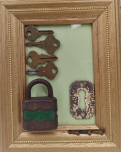
Padlocks with colour are quite unusual. The green on the lock is quite distinctive as well as the scalloped pattern above and below the green stripe. www.historicallocks.com/en/site/h/padlocks/the-history-of-padlocks/ Padlocks are utilitarian at heart, yet a designer of this lock decided to add the embellishments to make the lock more attractive. I made the lock the center piece of this design and added the gold and green accents to go with it, 5”x 7”.
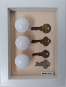
This Found Object collage is a compact size that would make a good décor accent on a desk or shelf. Three shiny white ceramic doorknobs along with four keys of differing sizes are a simple yet appealing arrangement. www.vandykes.com/blog/hardware-blogs/brief-history-door-knobs/b/brief-history-door-knobs/, 5”x 7”.
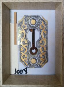
The intricate design and detail of a key plate cover is highlighted here by an enlarged photocopy, filled in with gold. The design elements flow around an antique key in the centre: the letters spelling out “key,” and the plate cover. The two paper strips on the left provide further vertical elements to balance the direction of the key, while the texture of the paper contrasts with the metal. I like the way the deep shape of the frame creates a “shadow box” look, without being enclosed in glass, 4”x 7”.
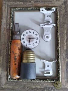
The printing on the bottle opener is from the Carling Brewery’s Blue label brand. This has a fascinating link for me since I live one block away from Carling Street in Exeter, named for Isaac Carlton. He was the son of the founder of Carling Breweries, Thomas Carling. www.wikipedia.org/wiki/Isaac_Carling Thomas Carling built the Breweries in London in 1843. www.images.ourontario.ca/london/details.asp?ID=69518, 5”x 9”.
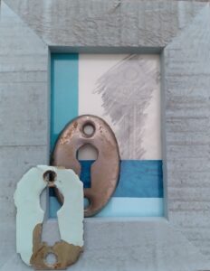
I chose a coloured frame to inject a more modern note into this Found Object collage. I matched the old paint on the blue keyhole to the frame so that the colours would harmonize with a room in the same tones. I made a pencil rubbing of an antique key as a soft background to contrast with the harder metals. www.allaboutdrawings.com Pencil rubbing, or frottage, is a technique pioneered by early Expressionist artists. www.nationalgalleries.org, 3″ x 5″