Zenfire Pottery and Mercantile
St. Mary’s Ontario
Selling memory boxes in St. Mary’s fits perfectly with my notions of nostalgia and looking back. The town has a beautifully well-preserved 19th century downtown: its nickname is “The Stone Town.” There was a broad industrial base in and near the town, making for a connection between industrial Found Objects and the area. I visited Zenfire to look at the owner, Angela’s, pottery, and other retail selections. While not a gallery, all the items for sale are handmade by local artists. The Memory Boxes I chose to sell at Zenfire were custom made to reflect not only the town, but also to correspond in style and size to what was already in the store.
Round and Yellow Tin
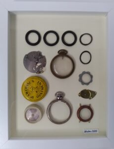
“Round with Yellow Tin” is a study in circles. The colour focal point is the bright yellow lid from Dr. W.A Chase’s Ointment, touted as “antiseptic, soothing and healing.” The lid features a solemn bearded gentleman with glasses, meant to look both trustworthy and knowledgeable. In 1904, Dr. Chase also sold Nerve Food, Liver Cure, Backache Plasters and Syrup of Linseed. The tin’s bright colour would have made it stand out from other boxes and vials, which would have had had darker colouring and black ink. The tin dates from 1923-1943 and was made by the Chase Medicine Company in Canada. Pocket watch parts, gaskets and other round objects complete the design.
Saint Mary’s Bottle Cap
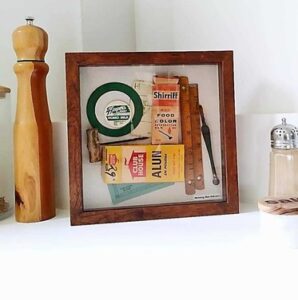
I was sure that the memory box titled “St. Mary’s Bottle Cap” would generate local interest. I placed a green and white bottle cap from Hooper’s Dairy of St. Mary’s in a key spot. The dairy seems to have been large and prosperous industry in the area, open as late as 1966. Angela told me that two groups of people had noticed the bottle cap and a discussion had started about local businesses. I added more colour with the addition of a Shirriff food coloring box and a Club House Alum box. Other small industrial tools bring a warm glow of wood to complete the piece.
Toronto Artist’s Alliance
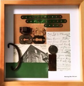
I conceived of combining objects that are green and metal pieces of various shapes and sizes for “Toronto Artist’s Alliance.” The title derives from a black and white postcard which has an unusual photographic angle of the building which housed the Alliance. I used the reverse of another postcard to highlight the penmanship of the era. The green items naturally form a tonal overlay, with the greens all in the same range.