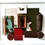
Goderich Co-Op Gallery
Located in Goderich Ontario, Goderich Co-Op Gallery is a collective enterprise with over 40 participating artists. Categories of art include stained glass, needlework, jewelry, oil and watercolour painting and photography. Each artist has a separate section of their own to display their art. The Gallery rotates the placement of the works every six months. Artists mostly live close by and work in the gallery, which is open Wednesday to Saturday. The CoOp started in 2002 and is located at 54 Courthouse Square in the centre of Goderich. The Gallery jury accepted my work in 2019. I sell original pastel works, pastel prints, and memory boxes.
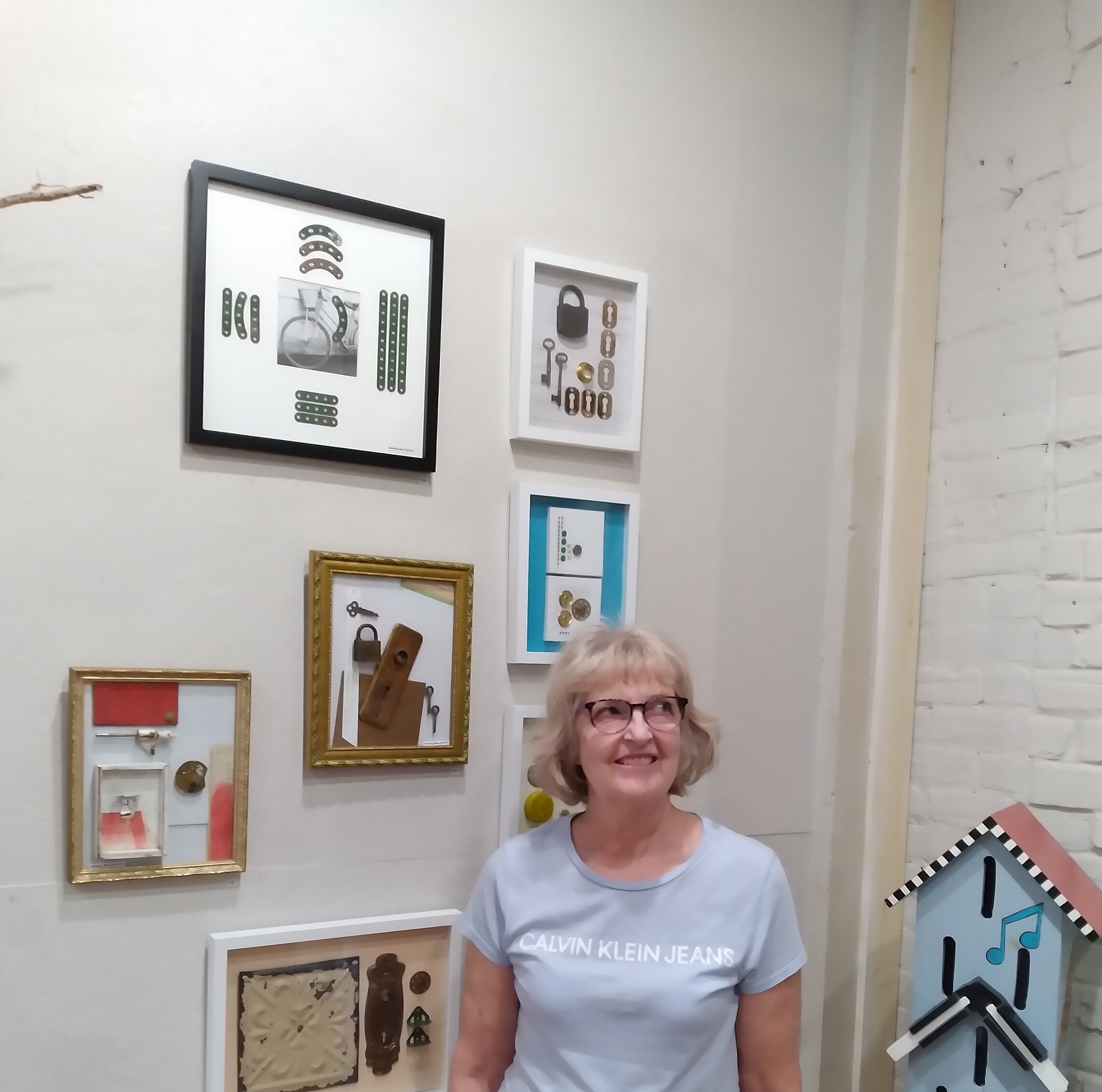
Since I started exhibiting at the Goderich Gallery, my memory boxes have keenly interested customers captivated by the found objects with local markings, specifically from places such as St. Mary’s, Goderich, and Guelph. Four pieces I have sold there were early work of my experiment in memory boxes and found objects. In the Gallery section of this web site, you can see photographs of these pieces, labelled “SOLD.”
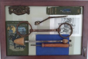
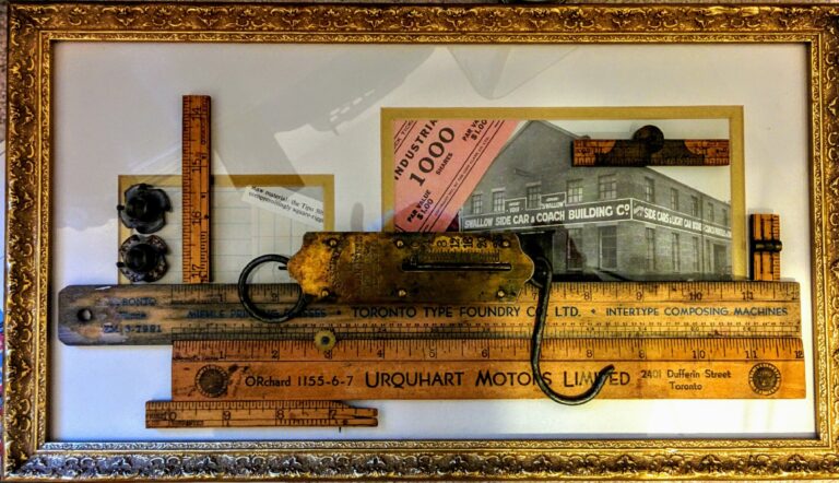
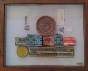
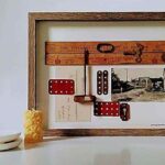
Early 20th C # 1
In “Early 20th C # 1,” I made my first attempt to combine antique Found Objects in a two-dimensional work. I was attracted to the beautiful worn and yellowed colour and texture of the rulers. They were used as practical and low-tech advertising pieces, an early variation of today’s digital billboards and pop-up ads. They remind us of small businesses, hardworking entrepreneurs and eking out a living by handing out a simple marketing tool like a ruler. Of course, the wood is such a contrast to the plastic objects of the present day. This is one of the few memory boxes where I used an existing mat behind the objects. I matched black and white industrial photos with the mat openings.
The brass scale is the centre piece of this work: also known as a spring scale, mechanical scale, or fish scale. These handy weight measurers were first introduced when springs could be widely manufactured, around 1770. They replaced balance scales in many applications and eliminated the need for weights, using gravity instead. Their attraction for me is the shine and warm colour of the brass, the interesting, curved hook at one end, the graphic scale and numbering on the flat part, and the large circular piece with which to hang the scale.
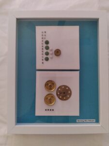
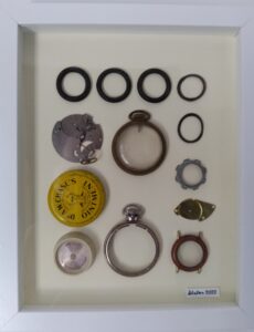
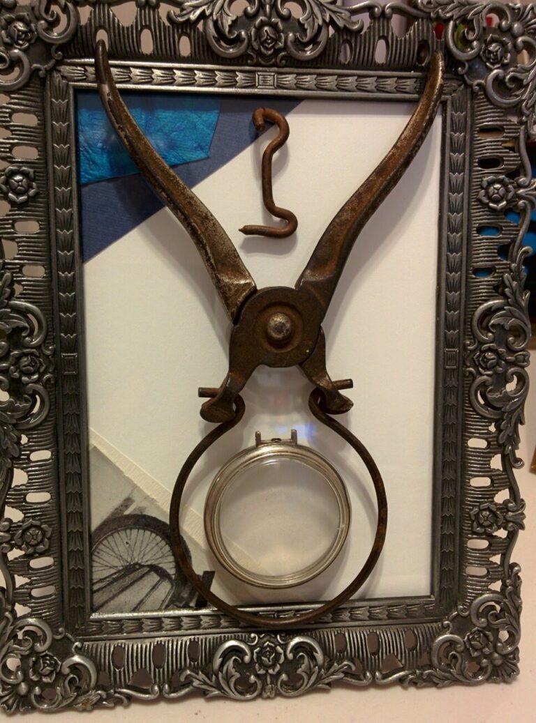
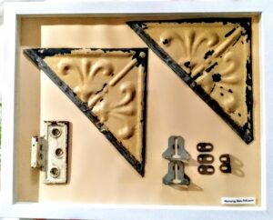
Bicycle and Round Tool
I sold a smaller, desk-top style piece at the Gallery in 2020. With a colourful background and striking set of round objects, it was called “Bicycle and Round Tool.” I used the round shape of a vintage jar opener in conjunction with a watch face casing to create an interlocking set of round shapes. The filigreed, decorative metal frame makes a contrast to the utilitarian material of the tool. I used two deep blue paper swatches to add colour and texture.
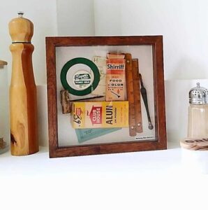
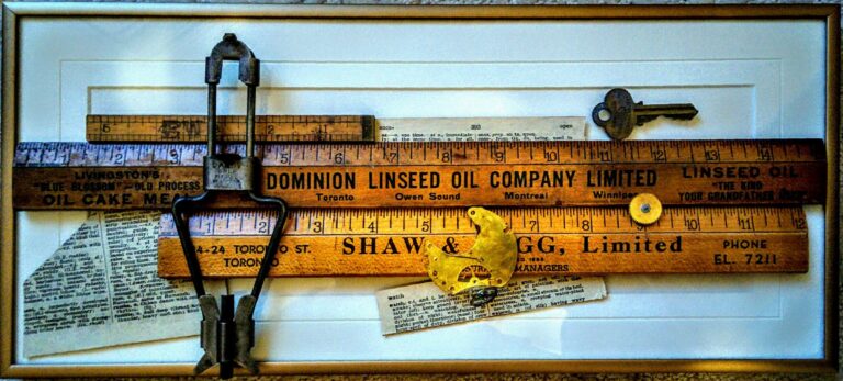
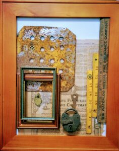
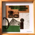
Early 20th C # 2
“Early 20th C # 2” was sold in the summer of 2022. I used the wooden rulers in a comparable way, but this time combined them with dictionary excerpts and watch parts. The purchaser recognized one of the names on the rulers as a former place where he worked. The memory was one he wanted to keep in his home.
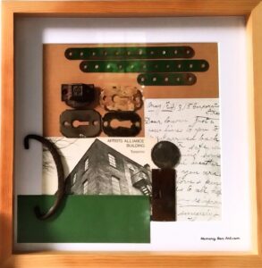
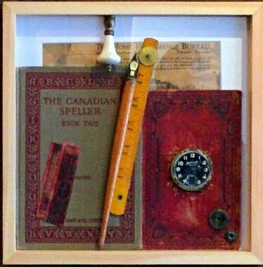
Canadian Speller
Finally, “Canadian Speller” is the first memory box I created using old book covers. I thought the deep red of the covers plus the wood and antique pieces resulted in a pleasing composition, especially with the modern, plain frame. I used the sparkly gold watch parts as a differentiation in materials with the matte book covers. Legislation was passed in Ontario in 1884 mandating that schoolbooks were written and published here, and other provinces and the federal government followed suit. These early books are a unique part of our Canadian heritage in both publishing and writing.